Happy Saturday!
Before I share this weeks project, I want to let you know I added some fantastic women to my blogroll. These women all inspire me in one way or another and I thought it might be nice to give them a shout out. In particular, my amazing cousin just started writing Scalarious; check it out if you ever wondered about living in blended family.
I’m always on the lookout for artwork that inspires me. One artist that always captures my attention is Teesha Moore with her fantastic use of color and the whimsical pages she creates. Using images from magazines, she makes extaordinary layouts that are a feast for the eyes. Since I’ve been upcycling magazine pages a lot lately, I thought I’d try using magazine elements as my focal point and create something a la Teesha.
I started here (and this time I’m working in my spiral bound journal which is 9×12)
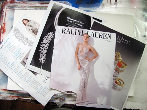 They were in a pile of pages I’d pulled out of magazines because they spoke to me in some way or another. At this point, I had no idea where this layout would go. So, I prepped my page with a layer of gesso and then decided to use a sheet of tissue paper (which meant I could have skipped the gesso for once).
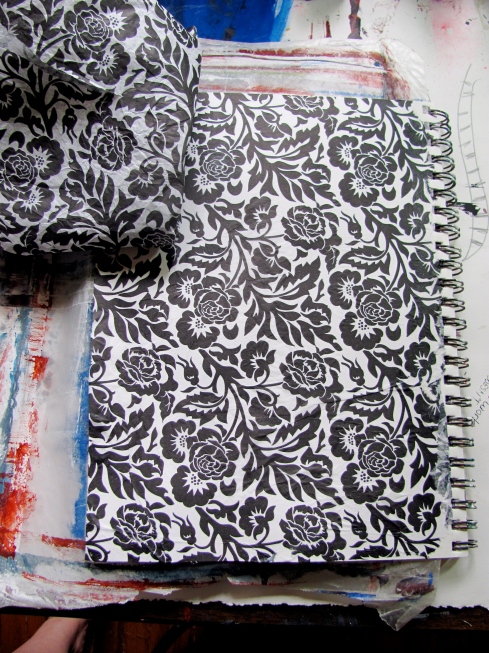 I added a wash of red watercolor which was too intense so I softened it with some gesso (and in the process, tore the tissue so I had to add more. Keep in mind when using tissue that it’s delicate to avoid this frustration)
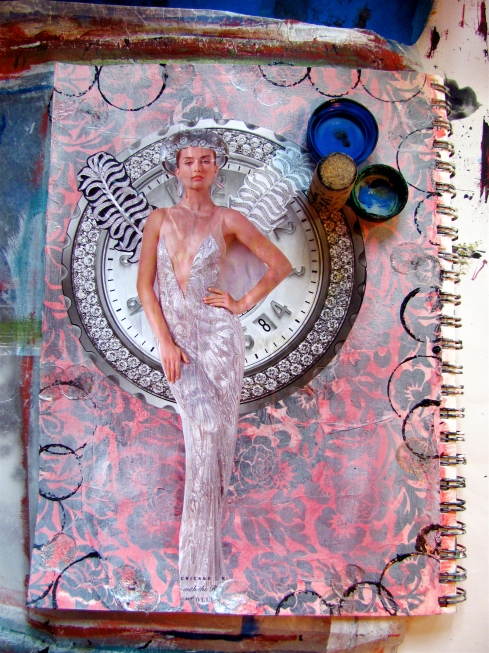
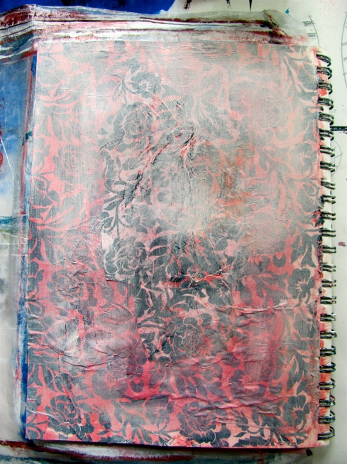 I started cutting out my images and that is when the layout started to take shape. The diamond ring became her crown and the diamond pins became wings. The clock face was a natural backdrop for her.
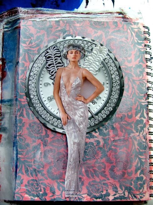 I’m not sure what drew me to these elements; I don’t live in luxury nor am I dripping in diamonds but for some reason, all this silver glitter spoke to me. I do like how well they all go together; they are all in the same color pallet – black, white and silver. There’s no doubt what the focus is on this page.
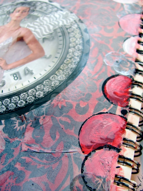
I added circles around the border of the page (repetition of the circle in the focal point) using 2 bottle caps and a wine cork.
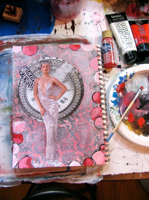 I filled them in using various shades of red and white.
 I stopped here. I’m sure I could have added a lot to make this page really over the top. But I like her as she is. And sometimes you have to know when to stop.
All in all, I was really pleased with the way this page turned out. It’s not as fantastical as Teesha’s pages, but then, I’m not her.
I’d love to know what you think, so please leave me a comment!
Till next week,
Cheers,
Michelle
Wow Michelle!! This is gorgeous!!!!
Thank you so much!
I love what you are doing here. I really need to sign up for this site. I haven’t done anything in my art journal in about 6 months. You are helping me to find time to get started on it again, thanks
Thanks, Teri! Let me know when you get your journal out again – I’d love to see your pages….send me pics on facebook
This is so neat. All the elements just seem to fit together perfectly.
Thank you! I thought so too!
I like the collage work. It does all go very well together to create a powerful image. I, too, admire Teesha Moore’s work, but I find it difficult to emulate it. Like you, I have decided that I’m just not her, and while I admire her style, it isn’t me. Although, admittedly, her work has inspired some of my own spins in layouts.
It’s cool to hear from someone who gets it! Thanks for sharing.