Archive | January, 2013

The one with more pictures than words

26 Jan

Happy Saturday.

For various reasons, (lots of overtime at work, a cold etc) I haven’t had time to be creative (SAD!). So this week, I’m going to share some of my early art journal attempts. My first few layouts were my attempt to get back into painting so there’s no real rhyme or reason. However, it was fun to look back over my journal to prepare this blog post and see my style begin to emerge. That’s a big part of the reason I try to paint often; to find my style, to continue to develop it and make it better. And cause it’s so much fun!

I started my journal before my blog so there aren’t any step by step photos.

early art journal

early art journal 2

early journal 3

early journal 4

early journal 5

early journal 6

early journal 7

So, what do you think? Not a bad start I guess.

Till next week.

Cheers,
Michelle

The one with the recycled coptic bound journal

12 Jan

Good morning!

This week, I’m going to share a gift I made for one of my favorite people in my world (you know who you are!) I will warn you, however, this is the first time I’ve attempted this and it’s a bit less than perfect. But then, I’m no where near perfect, so, it’s a true reflection of me.

Anyhow, this idea came to me a while back. In real life, I work on a University campus. We get a fair amount of mail, and I started collecting the envelopes. Sometimes it was because  there was a cool stamp, other times I  couldn’t bare to keep throwing them away. Somewhere along the way, the idea of using the envelopes for journal pages was born. And then I thought, I’ve always wanted to learn coptic binding, so I’ll use these envelope pages to build the  journal.

This is where I began:

journal pages

All different size envelopes, different colors. Some with the cool windows (I love the crinkly sound they make!). After matching up all the like sizes, I cut them all open to create “pages”. I then put together 5 signatures of 4 envelopes each (which ends up being 8 pages and 16 sides per signature). I set the signatures aside and began on the cover.

journal cover

Yep, the base of the journal cover is a cereal box (told you this was a recycled journal!). I cut out two same size pieces and covered the shiny side with gesso.

journal cover 2

After the gesso, I added a layer of scrap papers. Which in turn got got covered in a layer of gesso.

journal cover 3

I used scrap book paper on the inside of the cover and did a masking tape boarder to give the edges a finished look.

Now came the really fun part. I started mixing colors and just started adding layers of paint. I used a circle stencil, bubble wrap, a creamer lid, a leave stencil, my fingers, all my usual tools and this is one cover:

journal cover 6

And this is the other:

journal cover 7

I went for bright cheery colors (maybe cause it’s been so gloomy and overcast here lately).

Now comes the not so perfect part. I’ve never done coptic binding before but I love it. It’s elegant and sharp looking when done right. Mine, well, it’s not terrible for a first attempt. The biggest problem was I used waxed linen thread that was too thick for the envelopes. If I had found thiner thread (say that 5 times fast), I think it would have worked out a lot better. If you are interested in learning coptic binding, I highly recommend SeaLemon’s video . Her instructions are clear, concise and  easy to follow.

journal

And here is the completed journal:

journal 4

journal 5

journal 3

journal 2

I think I’m going to try it again sometime with the right thread. We’ll see!

So, tell me, have you ever tried coptic binding? How did your journal turn out?

Till next week,
Cheers,
Michelle

The one with the image transfer

5 Jan

Happy New Year!

I hope everyone had a safe and happy beginning to 2013. We’re kinda low key at my house, but I did get to spend it with those I love the most.  Even better, I’m on vacation this week! Which means, I’ve been in my art room creating!

You probably already know how much I love Donna Downey and her artwork. I love her Inspiration Wednesday videos and I’ve gotten a lot of ideas watching them. So, when I saw this video showing image transfers, I knew I had to try it!

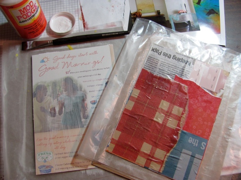
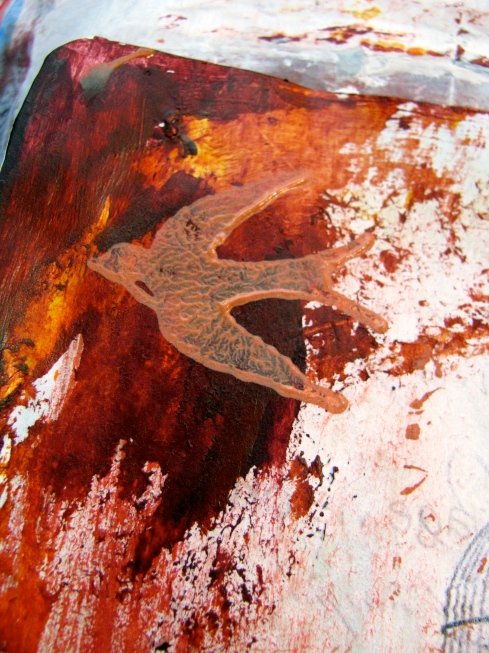
I started by printing a few images from Pinterest (and made sure they were copyright free images). I printed them on my ink jet printer at home on regular copy paper, so nothing fancy. To begin the layout, I started with a layer of gesso (sidenote, I picked up the Plaza Art brand gesso this week and I LOVE it!!!! It’s spreads nicely, covers well and it makes me  happy!)

After the gesso, I applied a generous amount of Golden Soft Gel Medium to the left page of the layout (Donna recommends this particular one and I just happen to have it – it worked wonders by the way!).

layout 1

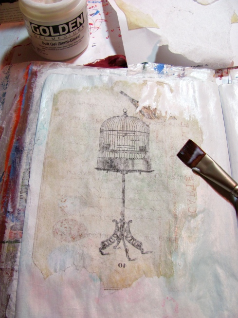
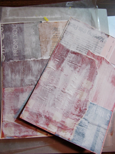
Next, I placed the image face down on the  page and smoothed out with a bone folder (this is called burnishing). After I was sure I had the entire imaged burnished, I let it set for a few minutes, then, pealed the paper off. Success – the image is left in the gel medium!

layout 2

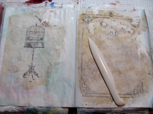
Another generous application of soft gel medium on the right page, and I transferred my second image. And it’s about this point I realized I should have chosen images with more color (next time). So, it was time to mix some paint.

layout 3

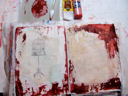
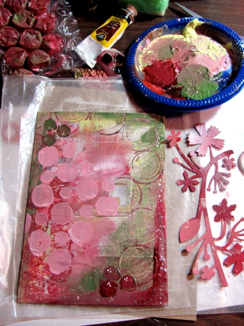
I used a mix of fluids and soft bodied acrylic paints for this layout and applied this first layer with a palet knife.

layout 4

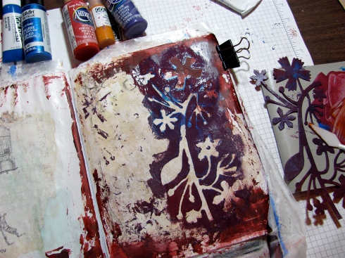
My next layer was applied using a stencil. I thought I wanted a pop of blue. I was wrong. So, I added a second layer of purple. Still wrong.

layout 5

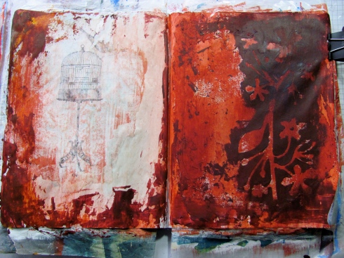
So, I mixed a new color and added a layer on the right and a wash on the left.

layout 6

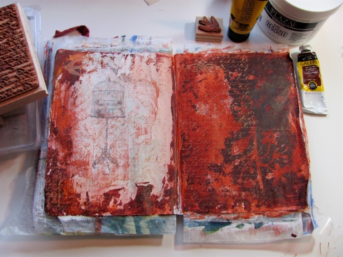
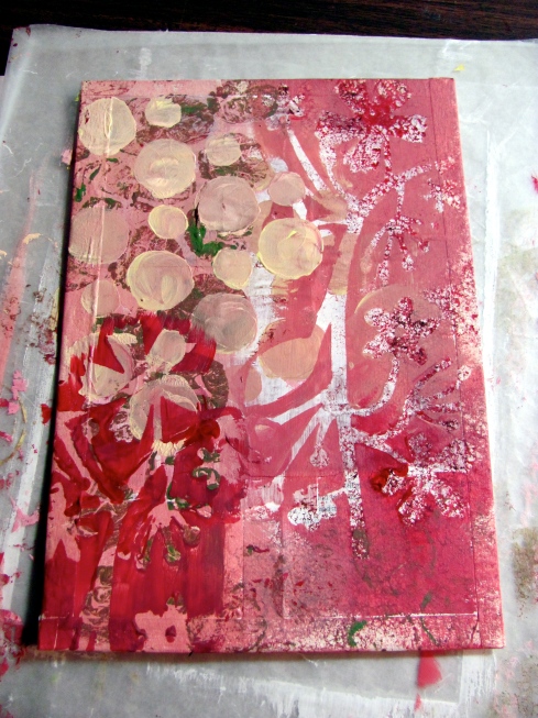
My next layer is French Script background stamp by Stampin Up. And then a few other stamps to add some subtle interest.

layout 7

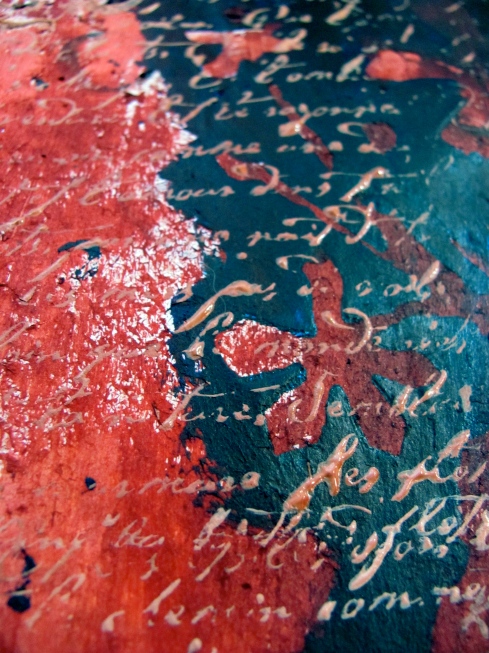
A close up of that French Script.

layout 8

Another close up.

layout 10

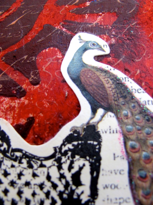
My final piece was going to be this peacock which I cut out of a greeting card. After adhering it to the page, I decided it didn’t really look right. It looked like it was stuck on the page and not really part of the design. So, I scraped up the last bit of paint on my palet knife and smeared it over the little embellishment.
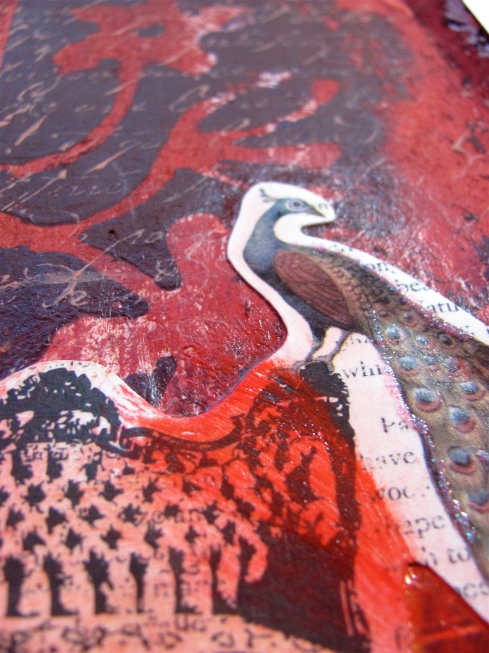
layout 11

Much better!

layout 12

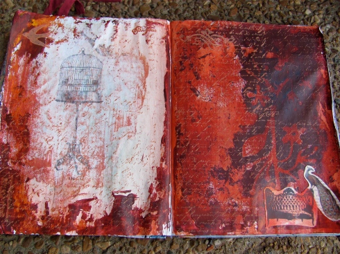
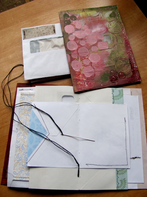
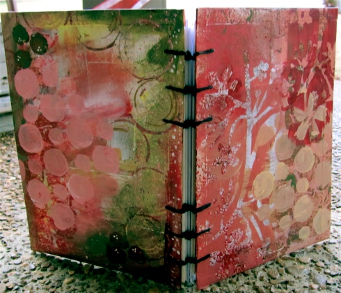
And here is the finished layout.

I think it’s one of my favorites. I’m not usually an orangey person, but for some reason, this combination really speaks to me. I really enjoyed this technique and I’ve already started printing out new images for another layout. Have you tried this before? Were you successful ?

Till next time,
Cheers,
Michelle